Penny Juice Redesign - School Project
UX/UI | Web Design | e-commerce
a quality user experience will make or break a business in 2026.
Defining The Problem
it's scary to use a website that was designed 20 years ago.
20 years ago, we lived in a different world. The internet was still a new thing, and businesses started to realize that they had to be there, it was going to be the next big thing. e-commerce also started to evolve, and businesses that could take advantage of it made big money quickly. Another thing that had to evolve to support this revolution was user experience, a subject that’s very close to my heart, as you can probably guess if you’re here 😉 People started to understand the value of solving problems related to using these websites. Just like you wouldn’t want to buy food in a place that looks like a junkyard, or you wouldn’t want to buy jewelry in a room with suspicious men around you, right? So why would you feel comfortable putting your money into a random website that looks strange compared to other websites, let alone entering your credit card details there?
The Task
redesign the obsolete website, to save the business
I was requested, as a UX/UI student, to redesign the website of a brand named Penny Juice. Penny Juice is a juice concentrate manufacturer. Their focus is on producing 100% natural juice concentrates, with their main audience being kids aged 4 – 12. Currently, their website is an e-commerce website, meaning that customers can order bottles of juice online. However, its design couldn’t be further from the current e-commerce and general website experience. It stands out as a horrible website. Penny Juice is struggling to increase sales, and I’m more than sure that redesigning and updating their website’s user experience would only help. My actual main goals with the website are:
Creating an easy purchase flow
In the end, the main goal here is to help customers purchase juice concentrates. the navigation and functionality of the website needs to be sharp and flawless. I want to make the purchase process happen in the easiest way possible, with as little friction as possible on the user’s side, all while keeping it clean, beautiful, and aligned with the brand’s style.
Emphasize the brand story
A business needs to create some sort of connection with its customers. It’s a relationship that needs to be maintained constantly. People need to know the history, values, and goals of a brand before they choose to start this relationship.
Giving the website a modern look
Currently, entering the website is truly scary. It seriously looks like a website that either isn’t going to work or is going to steal your credit card information. That’s the result of poor design choices made in the early 2000s. Cheap design back then maybe could work in a way, but now it’s just horrifying. A website is a living thing, and it’s the face of a company in our era.
The Research
Defining a “great experience” for an e-commerce website
I wanted to find the direct competitors in this industry and study their websites and the experiences they created. In the end, it all came down to a few factors that are prevalent across many other websites, but when dealing with e-commerce, where the goal is to convince users that the product is good, worth their money, and that they can trust the brand. everything is taken to the extreme. There’s no room for mistakes.
The 3 second rule
Capture attention, build trust, and guide the user in 3 seconds. As soon as the user enters the website, the hero section must tell them enough and convince them that it’s worth staying. We have about 3 seconds here, so we better be ready. Fortunately, it’s not that hard once a designer sees the design through the user’s eyes: clear hierarchy, a clear message, good images. C’est tout.
Simple navigation
we’re not trying to build a maze. We want a website that is easy to navigate back and forth, with as few clicks and scrolls as possible. This quick and effortless feeling is worth a lot when users are carefully exploring the website before making a purchase.
Less noise, more value
Everything that goes into the website has to go through a filtering process, because any irrelevant information can create tension in the user’s mind. We want to reduce that and leave only what’s relevant and helps increase trust and engagement. When we have something valuable to add, we’ll add it. Otherwise, we’ll leave it out.
Competitor Analysis
what makes the competitors stand out?



The juice concentrate industry is fairly small when it comes to brands with an e-commerce website. It seems like most brands don't really do e-commerce and instead sell directly to other businesses through traditional methods, such as phone calls and emails. But the ones that have moved into real B2C do exist. From the moment a user opens these brands' websites, the focus is on a clean hierarchy. The user immediately understands what the website is about and has a few product options to choose from right away. The websites aren't the most modern I've seen in terms of UX/UI trends and design, but they work, and they're clean. Easy navigation, everything in its place. Solid UX.
My plan is to do this as well. Getting to that nice user experience is a must, but I also want to make the website stand out in terms of UI, and that is the challenge.
There is a fine line between a good UI that's balanced with good UX and an ultra-beautiful UI that actually makes the website harder to use. It's something you see a lot in beginner designers' work. Complex UI, animations, and visual effects can be technically impressive, but learning how to create them is often easier than learning the deeper thinking and problem-solving required for good UX.
The old website design
First Impression
as soon as a user lands on the website, they can immediately feel the lack of visual hierarchy, and mess. There are many different typefaces and fonts, background colors, colored text, and a call-to-action button that’s difficult to read and notice because of the excessive use of color throughout the page. the use of imagery is also pretty poor. If it’s a juice concentrate company, we need to see it. currently, we mostly see kids playing with Play-Dough, and although there are some fruits at the bottom of the page, they don’t really look like they’re connected to juice or drinks. The text doesn’t tell the story of the brand, nor does it convince visitors that the product is worth buying.
No navigation – that’s a big one. if a user can’t navigate through the website and has to find their own way and improvise just to get to different parts of it, we have a problem.
Purchase Experience?
On the old website, you’re basically filling out a form with all of your details, and then choosing the quantity of each juice concentrate available. That’s not really an e-commerce experience. It’s more like filling out an administrative form. It’s only text, without any images or visuals to create a connection with the product.
The New Hero Section
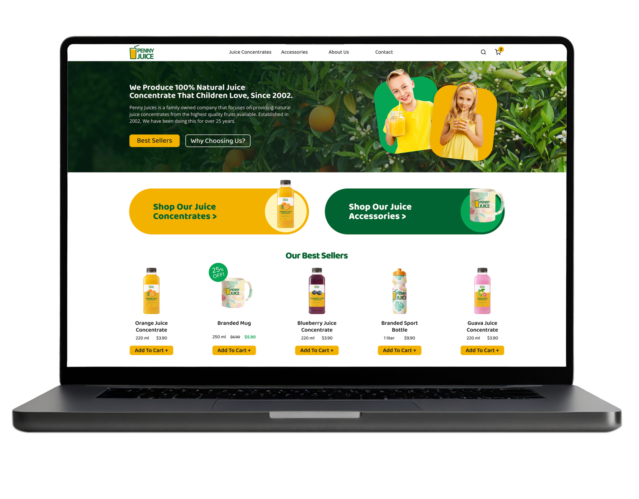
Navigation Bar – A user can access every section of the site, and the navigation bar always stays at the top. The menu also contains a search function for finding products on the site, as well as a cart element. Since this is an e-commerce website, we want users to be able to add items to their cart and pay for everything together. Every time a user adds an item to their cart, the number increases so they can easily see how many items they have added.
The Hero Section – The first focus is the image of kids drinking juice in the background of an orange tree, creating a natural and healthy feel. The next focus point is the headline, which explains what the brand is about, followed by a short paragraph. The visual language is colorful and appealing to kids and families, which are the main target audience. A new style guide was created for the brand, including new brand colors and typefaces that are used throughout the redesign.
Set of Buttons – The primary call-to-action button, “Get Juice!”, uses an accent brand color and takes the user to the juice concentrates page. The secondary button, “Why Choose Us?”, takes the user to a section that explains more about the company.
Best Sellers
Item Card – Items are displayed in a card-style layout, containing a clear image, volume, price, and an “Add to Cart” button. When there is a promotion, a green tag appears on top of the product image with the promotion details. The original price is crossed out, and the new price appears in green to indicate the saving and create a positive visual cue. I considered adding a “Buy Now” button alongside the “Add to Cart” button, but decided that for this type of website, where people are usually buying more than one item and the price range is relatively low (most items are $3-$8), a quick-buy function is unnecessary.
Go To Category – Next is a set of two large navigation buttons leading to the two product categories: Juice Concentrates and Brand Accessories. The buttons are large and use the brand colors. They also have a small interaction: when hovering, the image tilts slightly and the background color of the button changes hue, creating a subtle and engaging interaction.
Mobile Homepage Adaptation
since the start of the redesign, I knew I had to think about the mobile design, since it’s a crucial part of the user experience. a lot of the site’s traffic comes from mobile devices, so I’ve had to design the desktop screens in a way that allows me to later adapt them to mobile screen sizes. in the hero section, I’ve removed the short information paragraph since it adds too much information to a mobile screen, and there’s already enough information without it.
Menu – I’ve added a 3 bar menu (hamburger menu) in the top-left corner, since it’s a well-established convention nowadays and allows users to navigate the website easily. the button opens the menu on top of the screen the user is currently on. a background overlay is added to focus attention on the menu, and an X button replaces the menu button for easy closing.
Best Sellers Scroll – scrollable sections can make it easier to browse multiple items on mobile, so I’ve decided to turn the best sellers section into a scrollable gallery. this also saves space instead of stacking the items in a row and creating a less visually organized layout.
Category Page
The product catalog is accessed by clicking on the header menu into one of the categories, currently juice concentrates or accessories. a user can get there also by clicking the CTA button on the hero section, or clicking “shop our juice concentrates” button.
Breadcrumbs – the breadcrumbs are used for easy of navigation in the site, the user can always see his journey while using the site, going back if needed or just understand how it’s all organized.
Product Card – the product are organized in the same style as the best seller section I’ve used on the home page, to maintain consistency and visual simplicty.
Product Page
The product page is the place where decisions are made by the user. will he buy the product? how much of it? the user needs to see here information about the product, like what is this product exactly? how much does it cost? what does it contains in terms of nutritional value? what about the delivery? and the page supposed to make him click a single button: Add to Cart. so the goal here was to select what the user MUST see, and how it can be presented in a correct hierarchy, without confusing the user.
Main Focus – first, the user see the large image, in that case, the juice concentrate bottle image. there was a question whether the site needs to present a gallery of images, but I decided it’s unnecessary since the product we dealing with is a juice and not a clothing item for example, where it’s important to see more angles of it. next up is the title: orange juice concentrate. product volume. few positive tags under it for quick reassurance that’s a good product, not some unhealthy sugary drink. a short description paragraph. the price in large and bold font. then we have a labeled + – button for quantity selection, and a large, yellow, accented add to cart button.
Some More Info – under that first section i’ve designed the extra info section, including all of the nutritional facts of the product, and info regarding storage and consuming, so no info left out, and everything has it’s place on the page, elegantly, without creating any clutter.
You Might Also Like – in case a user wasn’t convinced to buy the particular product shown, or he did added it to cart but still want more, we’re going to show him some more product he might be interested in, just in case. I was asking myself: “is it too much? maybe we’re distracting the user?” but I’ve decided that on that specific website, where there’s just 2 categories and currently less than 20 items priced pretty low, it’s ok. were not losing users by showing them some more, in that case.
Products Category and Product Page on Mobile
on the mobile design, I decided to minimize the category page to a row of 2 items, to keep it minimal, anything more than that would have been overwhelming. the most important part was to keep all of the info readable, and consistent in relation to the desktop pages design.
The Shopping Cart
When the user clicks on the shopping cart icon, on the most right corner in the header menu, it will lead him to the shopping cart page.
Added Items – on the right side of the page, the user can see a list of all of the items he have added to the cart so far. an image, product name, price (and a discount if there is one), the quantity he chose, and he can add more or reduce through the + and – buttons. a total price of the items of that kind (Price X Qty.), and a remove item button.
Summary – on the left side of the page, the user sees the total summary of the order, including shipping, discount, and tax.
Don’t Forget About These – I have decided to include a last minute add an item list, in case the user might add one of these last thing before clicking checkout. honestly, i’m not sure how it will perform, but on a real product we can see the results on the tests, and see users behaviors around that section here. anyway, It’s not creating too much distraction since a user usually getting the the shopping cart once he’s ready to checkout, or he needs to edit the cart items.
Placing the Order
The final step of our journey. the user put in his shipping information, so the company will know where to ship his package to, and the he chooses his preferred payment method. in case he decides to put his credit card info, there is a note that the website is secured, and the company will never save his credit info. I’ve added this statement because this part is a very sensitive subject, and the main goal is to make the users trust the brand. While putting the information in, the user still sees the summary from the shopping cart page on the right side of the screen, and he can be sure it’s all correct still in case he might think there has been a mistake on the order. the “Place Order” button is greyed out until the user fill in all the required details, and then it would turn into the main CTA color to show t’s active and ready to be clicked on.
Mobile Shopping Cart and Shipping Info
To implement the same design on the mobile screen I’ve had to think in vertical view. so I decided to create a list the is the shopping cart, with all the info and functions i’ve put in the desktop version, and add a “total – checkout” bar on top, so the user can scroll through his cart, and when he decides he is ready for the next step – the button is on top. for the Shipping information – I have created input fields that fits the mobile size and grid, and designed a component that stays in the bottom of the screen, where the user can see all of the details about his order while he’s filling in all of the info.
Thank You Page
After the order had been placed successfully, we want to thank him for choosing us, and let him know important details regarding the order: estimated delivery time, where will he get updates regarding it? and an order referral code. also we want to give him ways to contact the company in case there is anything he want to know or the order isn’t arriving after the estimated delivery time. the page is designed like the hero section on the website, it’s an opportunity to put in some color after the “hard part” of putting all the details and placing the order, so it’s a positive page and the user can feel like it’s all good. the CTA her is “View Order”, so the user can double check that everything is correct and in case of any mistake he can quickly contact the company and make changes in the order.
Conclusion
the user experience is what builds a business
In the beginning “Penny Juice” was a 2 page e-commerce website. the user saw some info about the brand, and the next page was super basic ordering filling form. did it worked? yes, technically it worked. did it looked legit in 2026? not at all. it looked like a site that has been hacked and now they are trying to get credit card info from people who trying to order juice concentrate. the brands nowadays understand that it’s all about feeling of the user while browsing the site. every page needs to be perfect. consistent. relevant. you can’t expect to make money with a horrible looking site while there’s 10 alternatives online that look much better. in the end here the site is modern, easy to use and appealing, and the business can be sure that people can trust them, and their online presence, which would make them to increase their income.